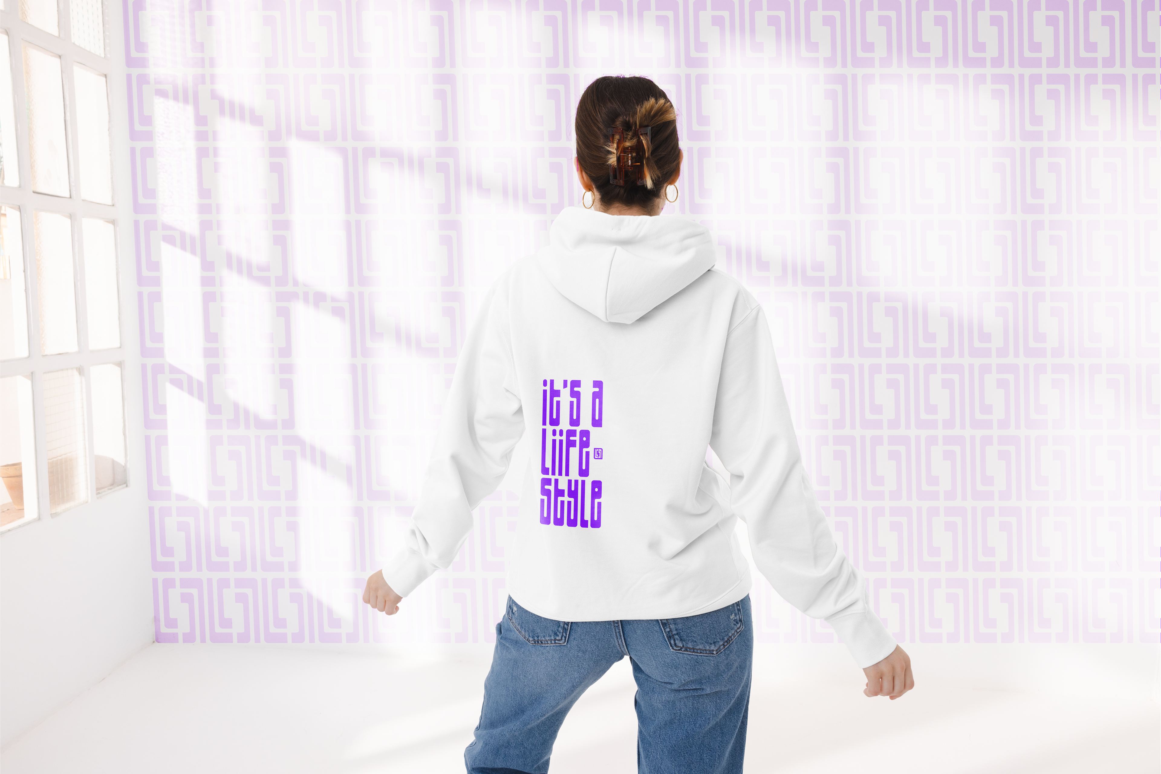
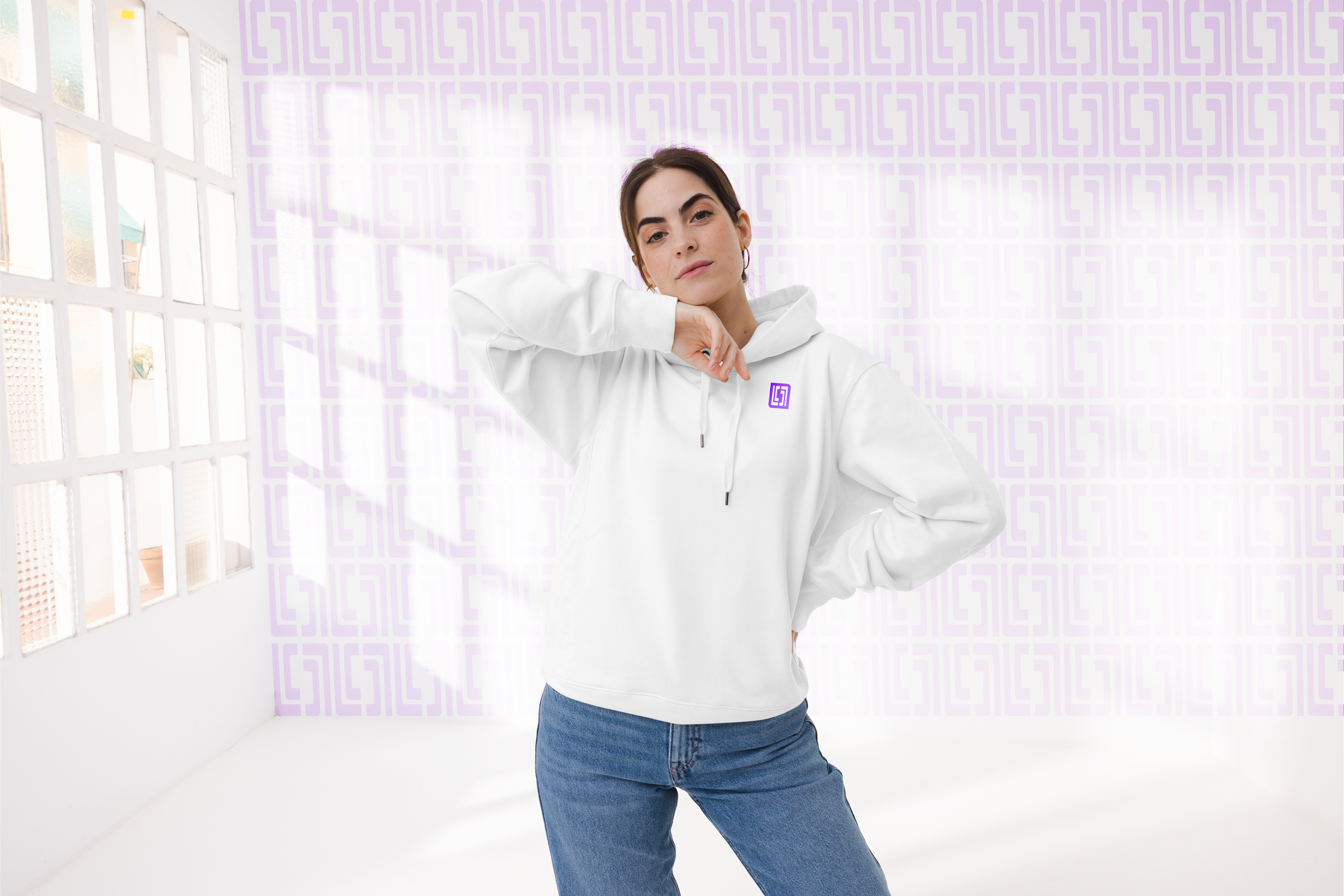
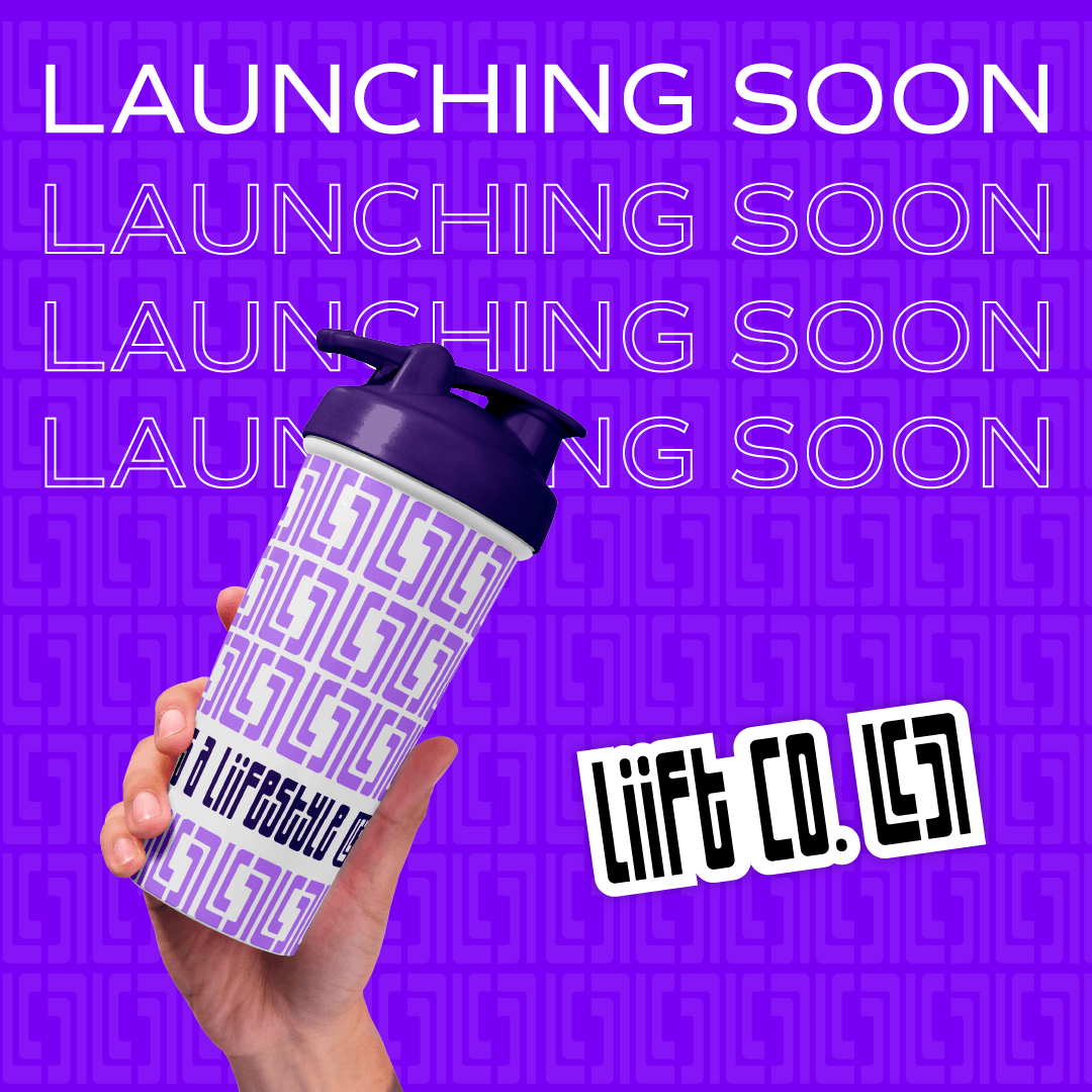
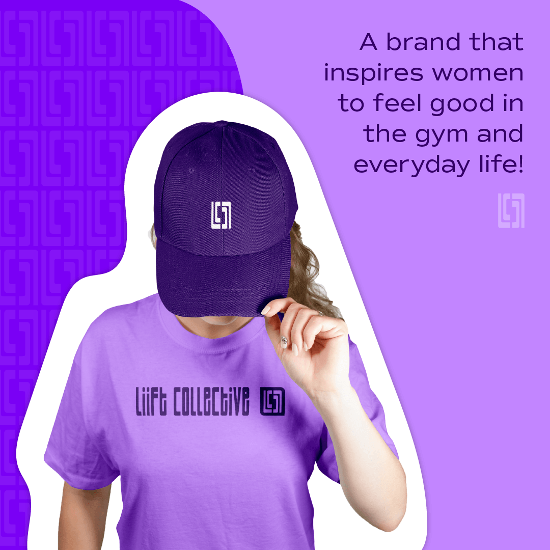
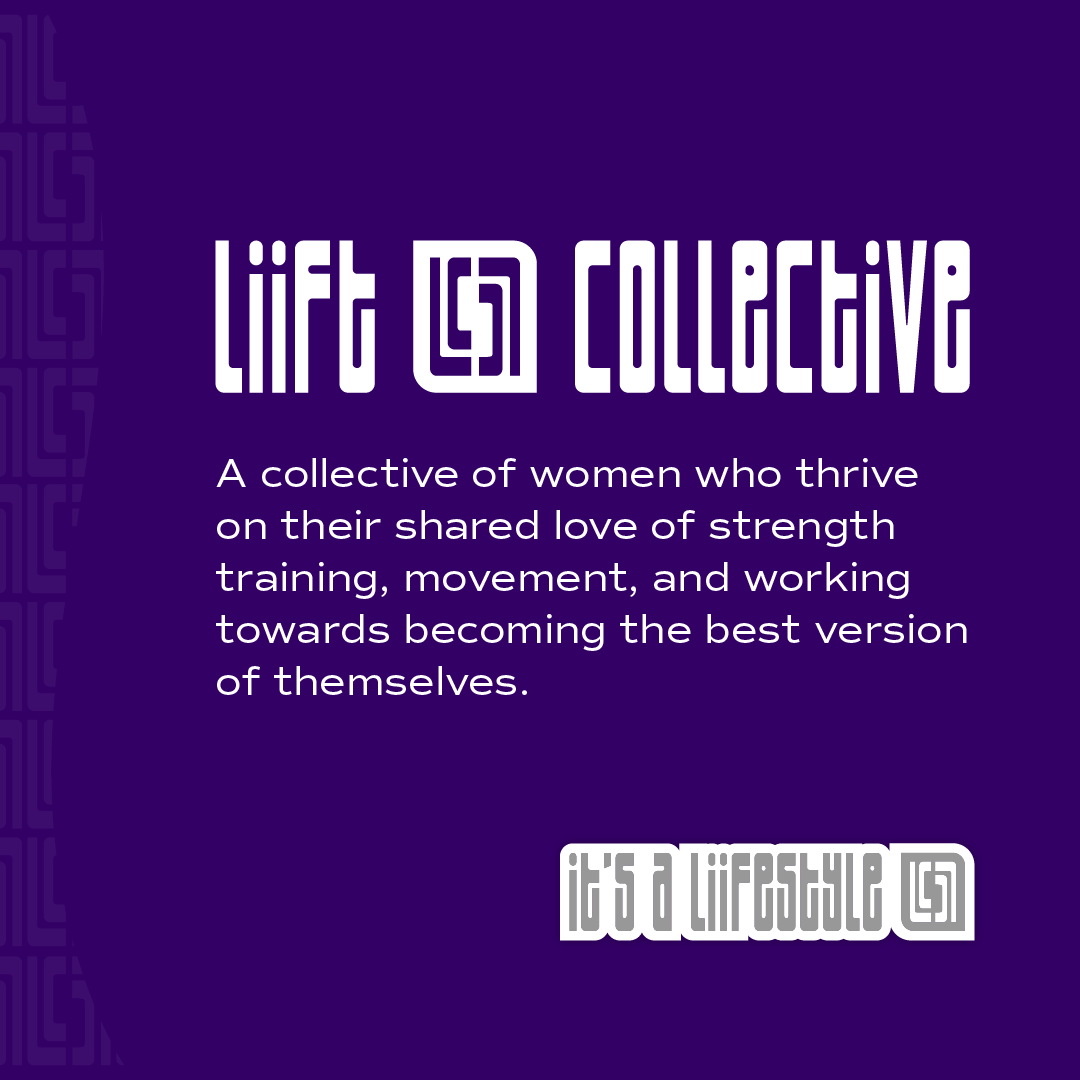
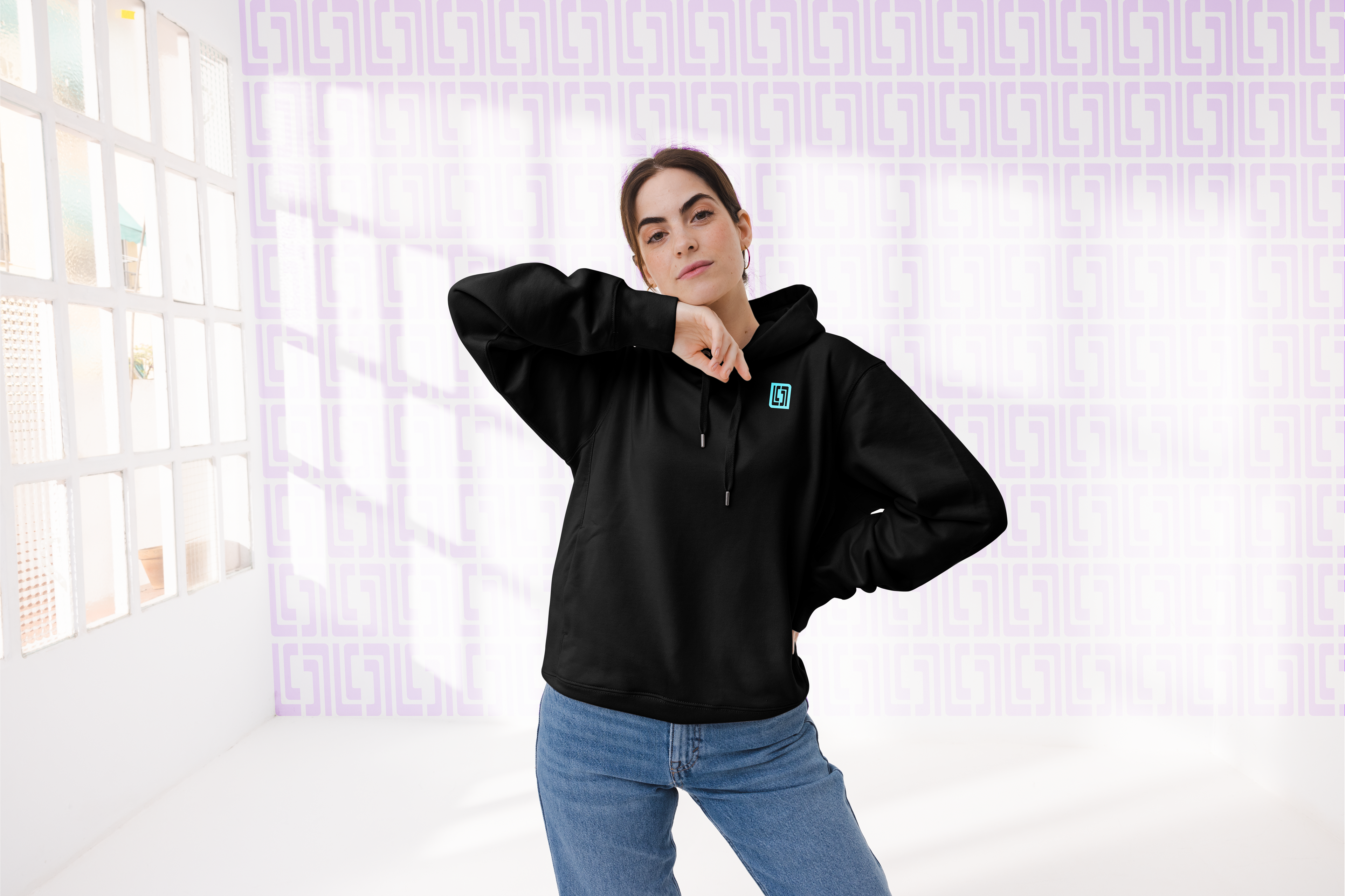
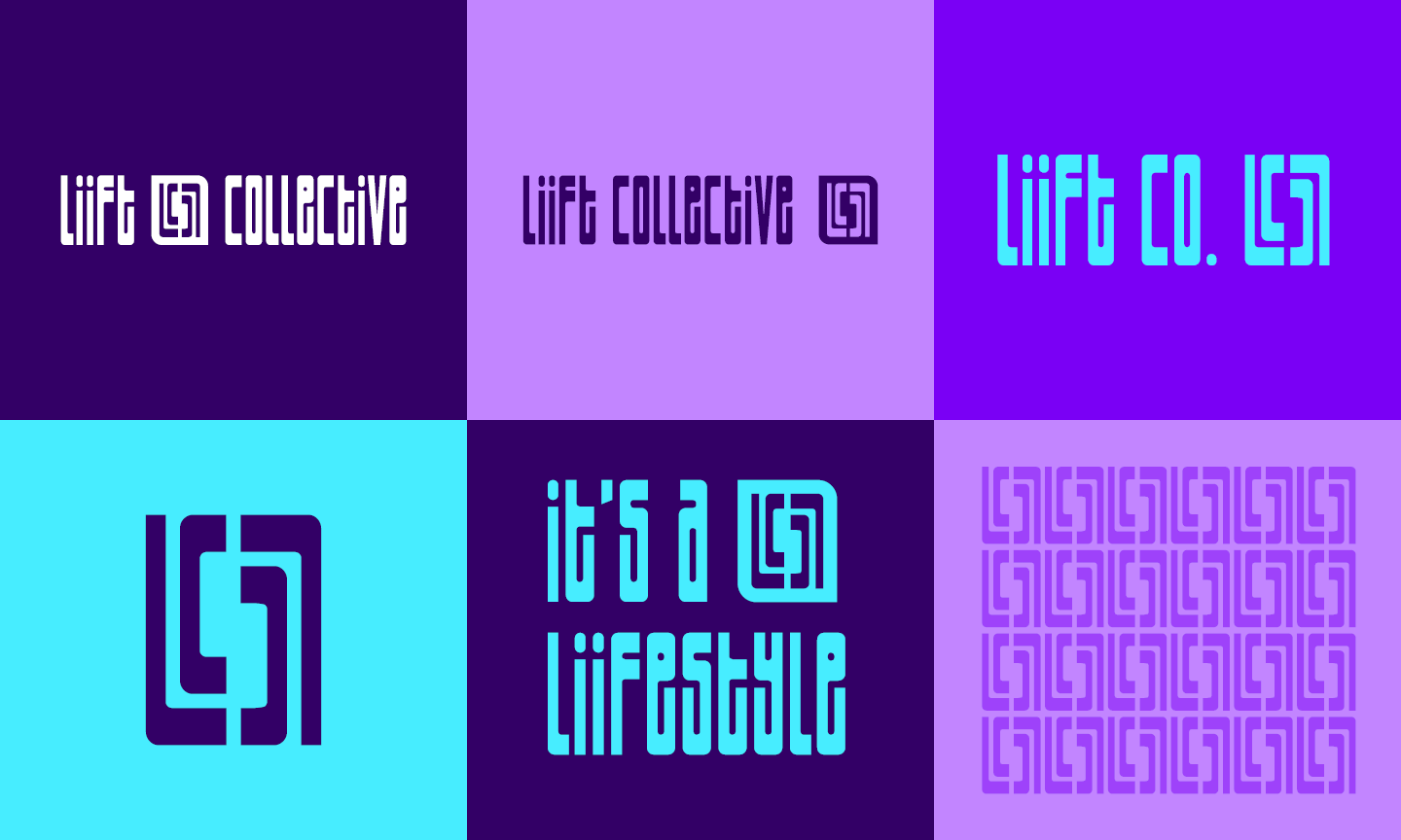
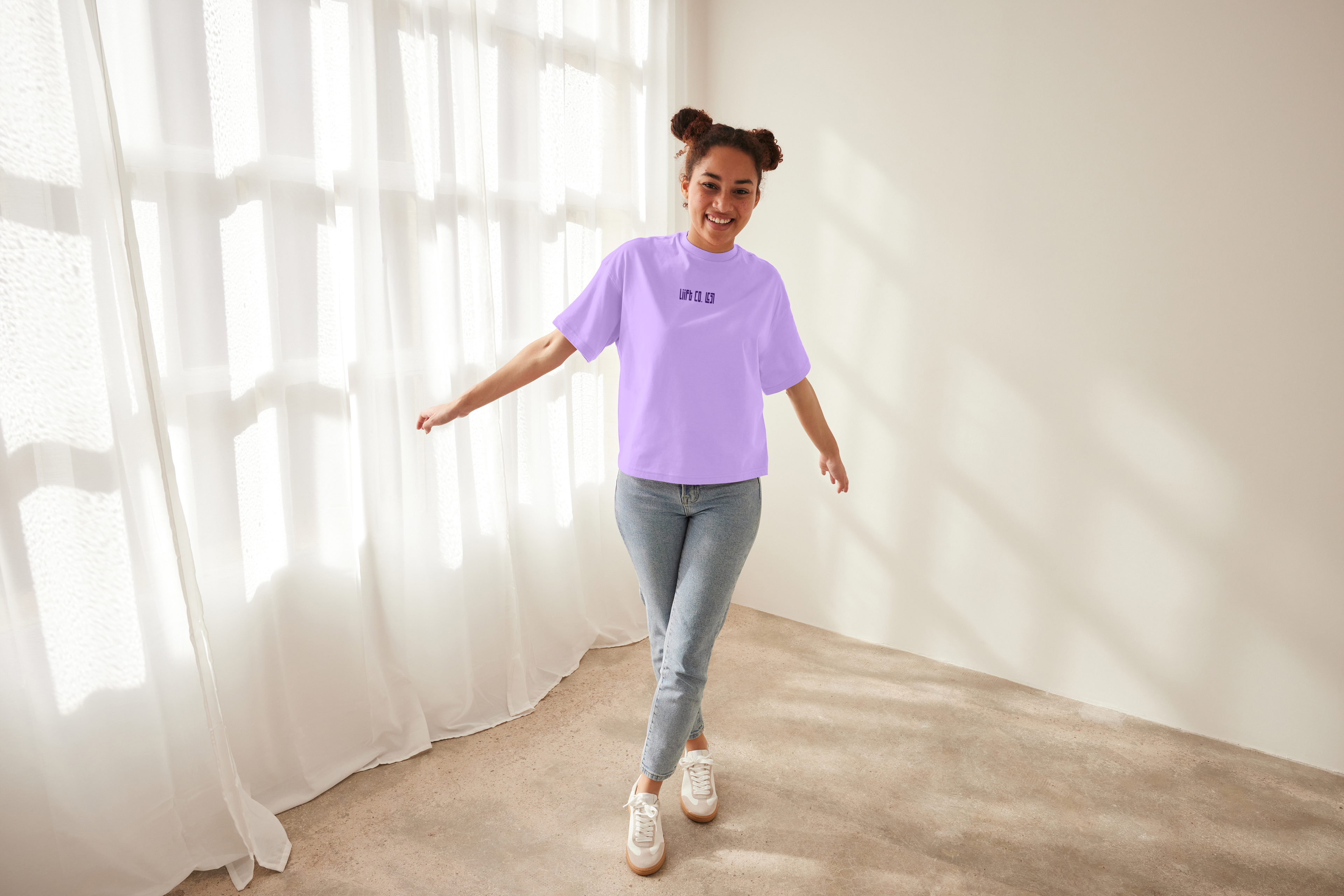
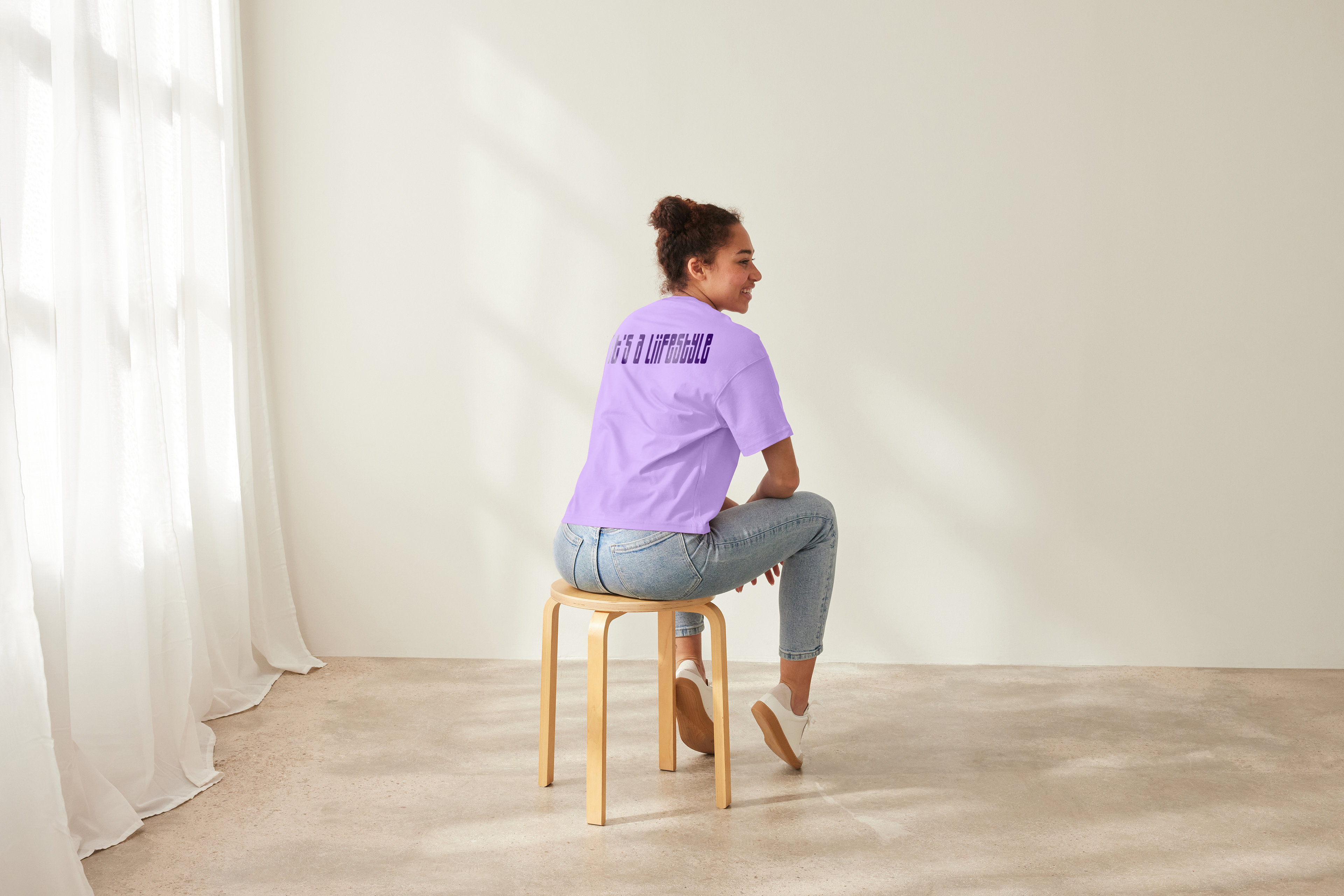
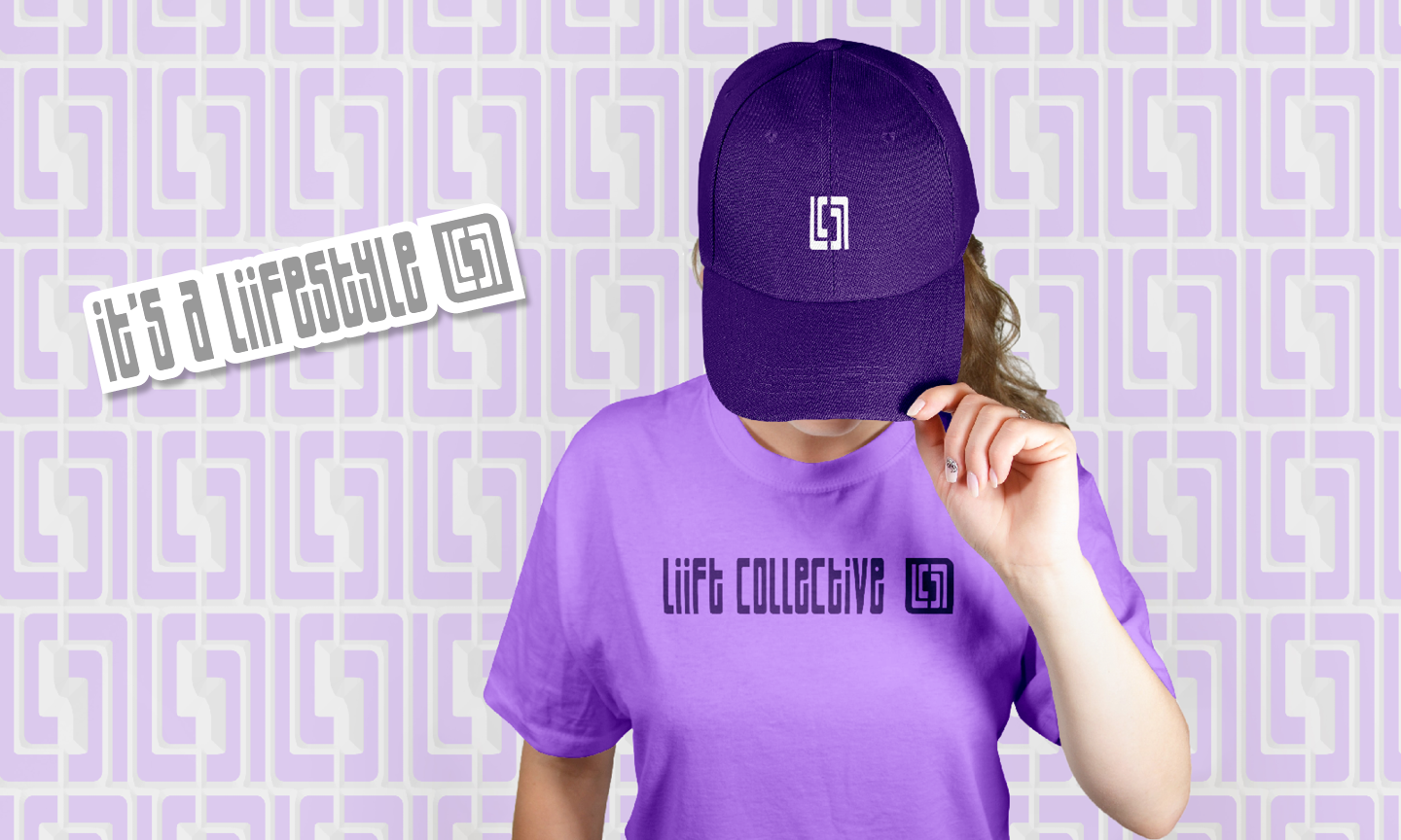
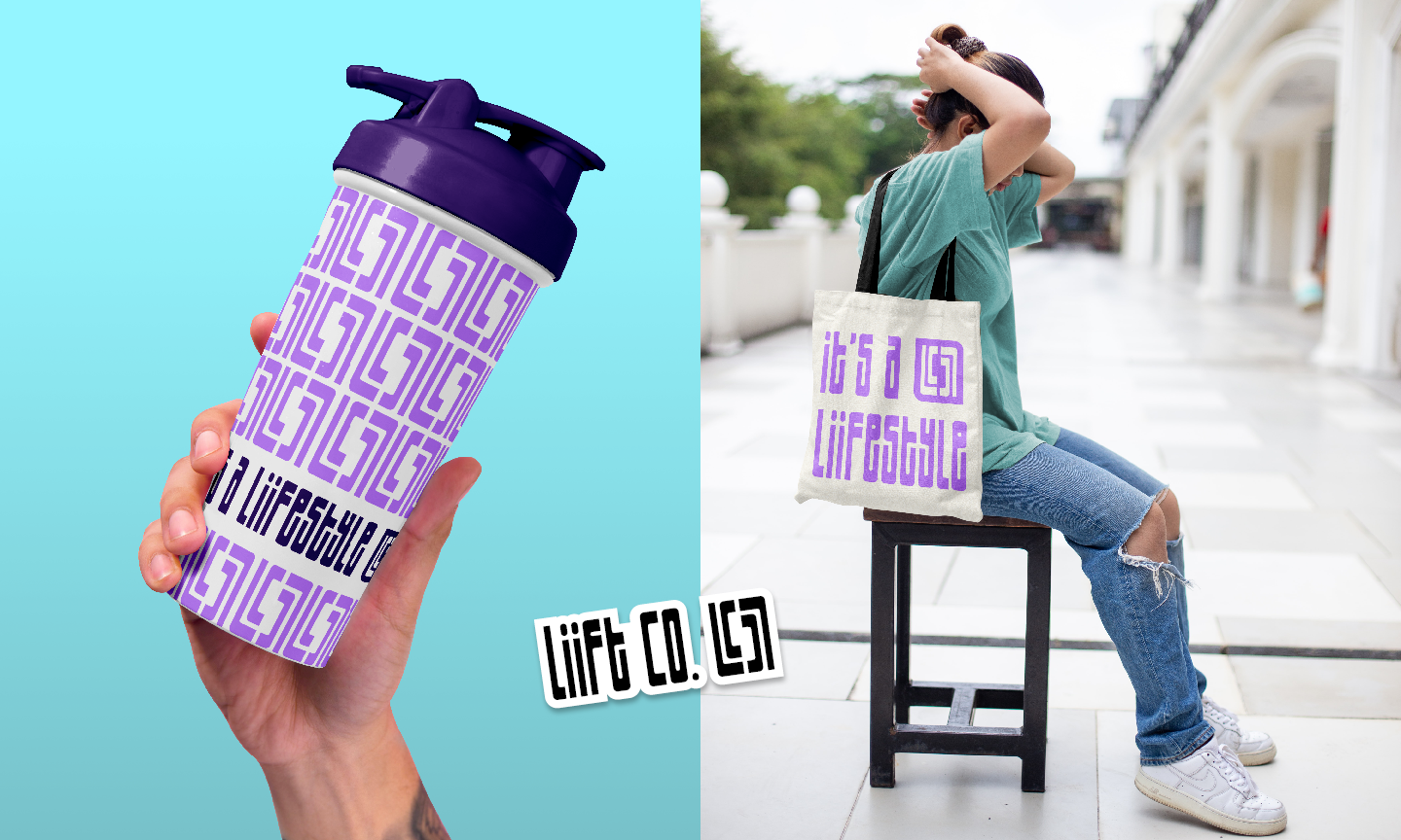
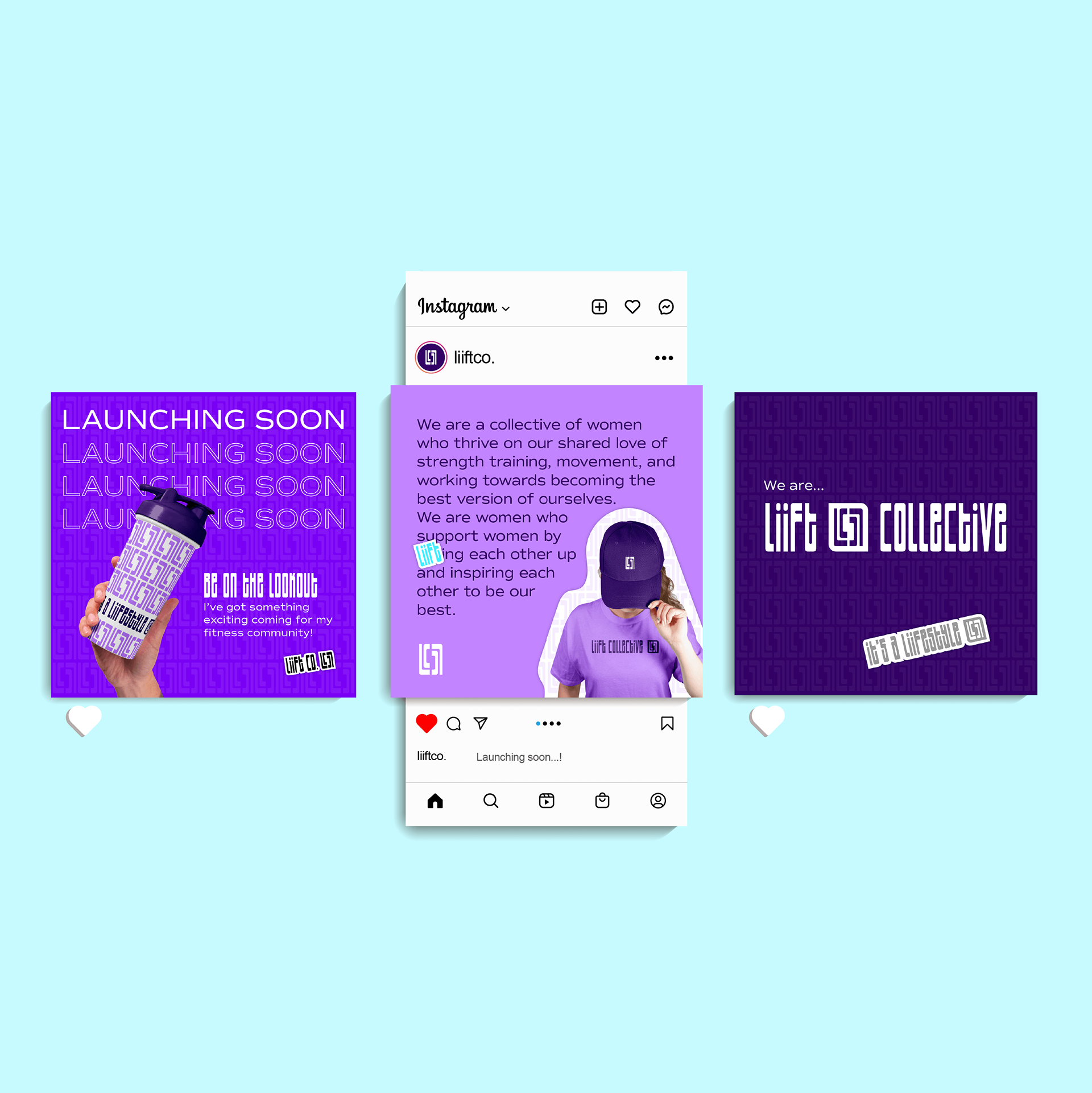
The client's main goal was to create a symbol that would become super recognizable and stand for something deeper than simply, "I like to workout". The symbol we came up with uses the LC from the wordmark and mirrors itself to stand strong and be always moving, as each letter ends another starts. I put together a bold and energetic color palette with a playful and feminine sans serif font that pairs nicely with the logo. This brand identity will help launch her upcoming fitness apparel brand she plans to share with her fitness community in hopes to inspire them to feel good in the gym and everyday life!